
Overview
In Germany, personal liability insurance is not legally required but widely adopted—around 83% of households hold a policy, recognizing its importance in protecting against accidental damage or injury to others.
VHV Versicherungen is a prominent provider in this space. While established competitors like Allianz and AXA dominate the market, emerging digital insurers such as Feather are gaining traction, particularly among expats, due to user-friendly interfaces and English-language support.
This case study explores how small but strategic improvements in usability and accessibility, such as clearer navigation, simplified flows, and multilingual support, could help VHV enhance its digital offering and compete more effectively in an increasingly experience-driven market.
Project Duration
1 week
Skills
User Research, Task Flows, Prototyping, Inclusive Design, Interaction Design
Tools
Figma, Photoshop
Project Type
Case Study
Problems
While VHV Versicherungen has made strides in digitizing its claims process, such as implementing the Guidewire ClaimCenter for motor claims, certain usability challenges persist that may impact customer satisfaction and efficiency.
Complex Navigation and Interface Design
Limited Multilingual Support
Delayed Response Times
Underutilization of Digital Tools
Insufficient Mobile Optimization
Opportunity
Modernizing the VHV mobile app offers a clear opportunity to align with the expectations of today’s digitally native users. As younger generations increasingly turn to mobile-first solutions, a claims process still centered around phone calls may no longer meet the needs of this evolving audience. Customers now expect intuitive, fast, and flexible ways to interact with their insurers, preferably through channels that feel natural and low-effort.
In addition to improving digital accessibility, there's an opportunity to rethink the overall tone and approach of communication. A shift toward a more approachable and informal tone, moving away from overly formal “Sie” language, could help create a friendlier, more relatable experience for users. Offering alternative language options, especially English, would also ensure that the service is accessible to a wider customer base, including international residents.
Thoughtful adjustments to the app’s design, tone, and functionality could go a long way in creating a more engaging and user-centered insurance experience, one that feels relevant, inclusive, and genuinely helpful.
How might we make the claims process feel more natural and accessible, for mobile-first users?
01 Research
Why improve the VHV App?
In the competitive insurance landscape, ease of use is a key differentiator. Emerging digital-first providers like Feather have gained market traction by offering clean, friendly, and multilingual interfaces that resonate with international and tech-savvy users. For traditional insurers like VHV, even small improvements in usability, design tone, and communication style can lead to major gains in customer retention and perception.
Lastly, improving the app supports a shift away from time-consuming and inaccessible phone-based processes. Digital self-service options, intuitive interfaces, and friendly in-app communication reduce pressure on call centers, speed up claims, and give users more control and confidence.
User Pain points
To inform the redesign of the app, I analyzed user reviews to identify recurring frustrations and usability issues. While some users found the app useful for basic needs, the majority expressed dissatisfaction with its functionality, reliability, and user experience. The most prominent pain points include:
01
Unreliable Login Issues
Many users report being unable to log in or stay logged in. The app frequently crashes or forces users to reinstall, making it practically unusable.
02
Poor Usability
Users describe the app as "not user-friendly" and difficult to navigate, with workflows that require unnecessary paperwork or lack clear guidance.
03
Limited Functionality
Key features like document uploads or making changes to insurance details are either unavailable or too limited, forcing users to call customer service instead.
04
Inconsistent Performance
Functionality is unpredictable, with users noting that the app only works sporadically, if at all. This undermines trust in the digital experience.
Personas
To have a better understanding of the issues, users might be facing I created the following personas to help guide my design process.

Laila M., 24
Freelance Graphic Designer
"Why do I have an app if I still have to call to change anything?"
Needs
Manage her insurance autonomously.
Access documents digitally.
Frustrations
Limited functionality compared to expectations.
Annoyed by outdated UI and lack of responsiveness.

Tony P., 32
Software Engineer
"I expect a seamless digital experience. Right now, this app feels like a beta version."
Needs
Avoid any offline interaction (calls, mail).
Manage everything on mobile.
Frustrations
Unstable app behavior and failed logins.
Doesn't trust the app for handling real-time requests.

Thomas W., 52
Sales Manager
"I have 10 minutes between meetings,I need the app to work without hassle."
Needs
Save time by avoiding unnecessary steps.
Manage everything digitally without needing support calls.
Frustrations
Unclear claim submission process.
Frequent app crashes, which wastes his time.
Design Goals
Understanding users' frustrations gave me countless opportunities for improvement. However, to stay focused and maintain perspective, I prioritized the most critical aspects. I distilled the key needs and translated them into clear goals for this redesign.
Streamline Core Tasks
Improve Information Architecture
Maintain Visual Familiarity with Functional Clarity
Support Mobile-First, Self-Service Use
Build Trust Through Transparency
02 Design
Redesign Approach
With the user personas in mind, I focused on creating a streamlined, intuitive experience that supports users in high-stress situations. My approach aimed to simplify key interactions while keeping the interface modern, approachable, and reassuring.
User Flows
To map out the user experience, I developed two primary user flows that represent how typical users would navigate through their most important tasks in the app:
Checking Coverage
When something breaks, users often panic and want immediate reassurance that their situation is covered. The first flow reflects this urgency by guiding users to quickly access and understand their insurance contract details.
Filing Claim
Once coverage is confirmed, users want to move directly into action. The second flow walks through the process of submitting a claim—step by step—designed to be as clear and stress-free as possible.
Final Design
After defining the key user flows, I moved on to wireframing, started by rethinking the landing page to present key actions and updates more clearly. The claims process was broken down into simple, conversational steps, asking users one focused question at a time. I modernized the UI to feel clean and trustworthy, while introducing AI-assisted features to help users in capturing accurate photos. Finally, I added a follow-up screen where users can track the progress of their claim and view past submissions, all designed to reduce uncertainty and minimize the need for support calls.
What would the home page look like if it truly supported users' most common goals?
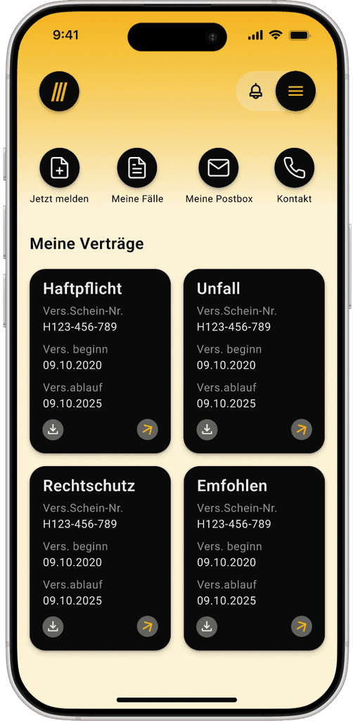
Quick Action Row
This module serves as a fast entry point for high-frequency user tasks, minimizing clicks and improving overall navigation efficiency
Notification Bell
Displays notifications such as claim updates
Hamburger Menu
Allows access to the main navigation
Serves as a quick action drawer, giving users an overview of their profiles
App Icon
This section provides users with a clear and scannable overview of their insurance portfolio, supporting both quick glance recognition and deeper interaction if needed
Contract Cards
Process Overview
Once the claims process begins, the user is presented with a clear overview of the upcoming steps. This builds trust by setting expectations and allows users to pause and return later, picking up exactly where they left off while seeing their progress toward completion.

Questions

I redesigned the way questions are presented during the claims process by replacing the cluttered, form-heavy layout with a single-question-per-screen approach. This reduces cognitive load, helps users stay focused, and creates the impression of faster progress. By breaking down the process into manageable steps, users are less likely to feel overwhelmed and more likely to complete their claim with confidence.
Upload Feature
This feature lets users upload vehicle photos by selecting specific sides. The visual layout makes the process intuitive, ensures all angles are covered, and helps reduce errors—leading to faster, clearer claims processing.

Submitted Claims

After submitting a claim, users see a clear overview and a progress bar that keeps them updated on the current status. They can also access a history of all previously submitted claims for easy reference and tracking.
03 Reflections
Future Steps
Working on this project, I was able to identifiy many opportunities to expand the app’s functionality and address more usability issues and painpoints. I have listed them below and am hoping to implement them at a later stage:
1. Desktop Version
So far, I have focused on improving the VHV mobile app experience. However, many users may prefer to complete the claims process on desktop. To ensure inclusivity and address a broader range of user preferences, I plan to explore a desktop version of the design.
2. Accessibility Review
For the desktop redesign, I will ensure the design adheres to WCAG standards. This includes auditing color contrast, testing screen reader compatibility, and verifying full keyboard navigation support.
3. Analytics Intigration
By identifying key KPIs (e.g., claim completion rate, time on task) and setting up proper tracking, I can integrate analytics that provide valuable insights. This data will support continuous improvement and help ensure the product meets evolving user needs.
What I learned
This project taught me how small UX improvements—like breaking down forms into simple steps or using visuals to guide input—can significantly reduce user stress and build trust. I learned to balance user needs with business goals, prioritize clarity in UI communication, and push for accessibility as a baseline, not an afterthought. Above all, it reinforced the value of showing users where they are in a process and what comes next—because transparency fosters confidence.